VBA自动化处理数据5-绘制图表
自动化处理数据一共写了5期,从初始的构想到最终图表的绘制。本期为此系列总结最后一期。
在绘制图表前需要思考的几个问题:
- 选取一定区域的数据,用来生成图表
- 将生成图表,放置到希望的位置上
- 调整图表类型包含是否柱状图,折线图以及主副坐标轴
- 格式化图表:填充颜色、设定图表标题、坐标轴标题
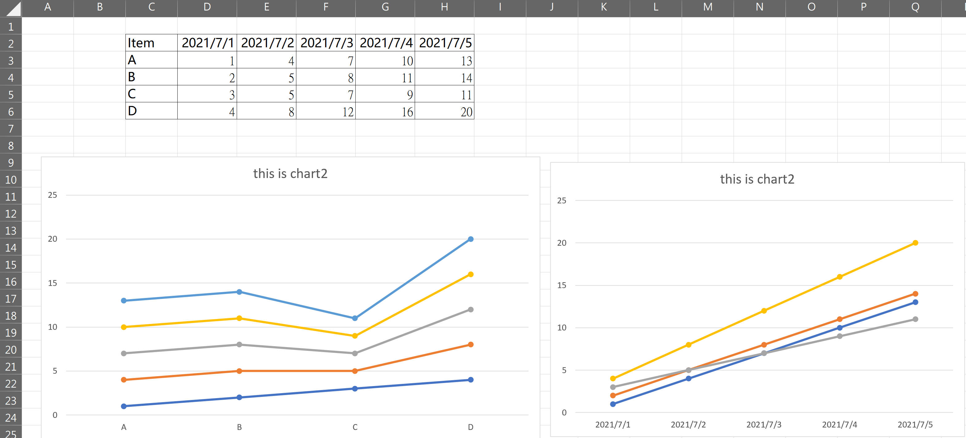
图表数据源
图表数据的来源,如果是完整的区域,可以直接使用range()来引用。如果是一个区域的某几行。那么就需要在绘制后删除其中的series序列
完整区域绘图
![image]()
1
2
3
4
5
6
7
8
9
10
11
12
13
|
Sub addchart()
Set chart2 = ActiveSheet.Shapes.AddChart2(XlChartType:=xlLineMarkers)
With chart2.Chart
.HasTitle = True
.ChartTitle.Text = "this is chart2"
.SetSourceData Source:=Range("c2:h6"), PlotBy:=xlColumns
End With
End Sub
|
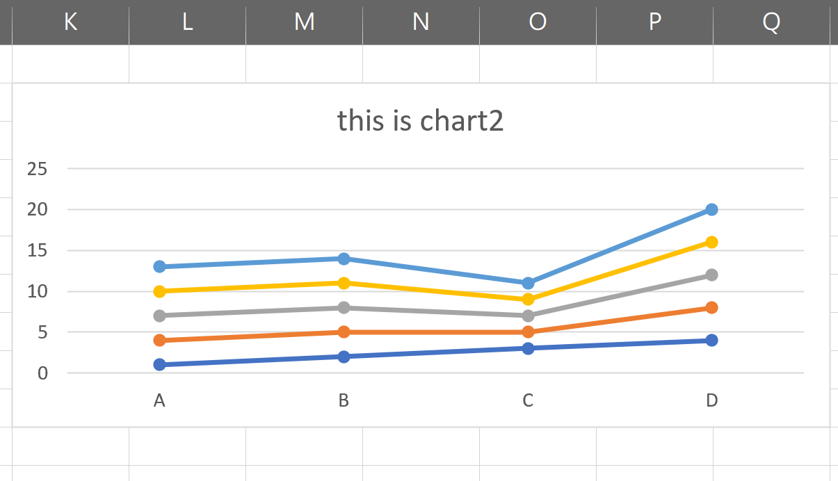
图表位置
我们在绘制出图表往往希望把图表放到指定的位置上。这里我们可以把位置区域选定好。然后设定图表的left,right,width,height属性来进行设定。
1
2
3
4
5
6
7
8
9
|
Set Rng = Range("K2:Q10")
With chart2
.Left = Rng.Left
.Top = Rng.Top
.Width = Rng.Width
.Height = Rng.Height
End With
|
![image]()
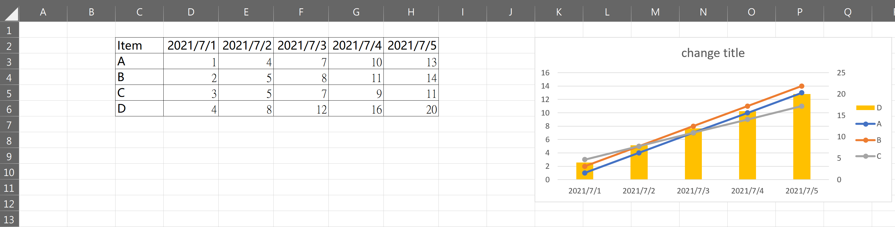
图表类型
图表类型包含图表的样式,是柱状图还是折线图还是饼状图等等。图表类型较多参考官方链接https://docs.microsoft.com/zh-cn/office/vba/api/excel.xlcharttype
1
2
3
4
5
6
7
8
9
10
11
12
13
14
15
| Sub changechartbyseries()
Set chart1 = ActiveSheet.ChartObjects("chartsample").Chart
With chart1
.SeriesCollection(4).ChartType = 51
.SeriesCollection(4).AxisGroup = 2
.HasLegend = True
End With
chart1.ChartTitle.Text = "change title"
End Sub
|
![image]()
图表格式化
这里主要是使用的录制宏的功能来格式化图表,毕竟参数太多。无法一一记下来。当我们录制完宏之后,删除掉多余的信息即可。
1
2
3
4
5
6
7
8
9
10
11
12
13
14
15
16
17
18
19
20
21
22
23
24
25
26
27
28
29
30
31
32
33
34
35
36
37
38
39
40
41
42
43
44
45
46
47
|
ActiveChart.FullSeriesCollection(2).Interior.Color = RGB(0, 0, 255)
ActiveChart.FullSeriesCollection(1).format.Line.ForeColor.RGB = RGB(255, 0, 0)
ActiveChart.ChartGroups(1).GapWidth = 75
With chart1.Chart.Axes(xlValue, xlPrimary)
.CrossesAt = .MinimumScale
.TickLabels.Font.Size = 8
.MajorGridlines.Border.ColorIndex = 20
.HasTitle = True
.AxisTitle.Text = " X value "
.AxisTitle.Orientation = xlUpward
End With
With chart1.Chart.Axes(xlValue, xlSecondary)
.CrossesAt = .MinimumScale
.TickLabels.Font.Size = 8
.HasTitle = True
.AxisTitle.Text = "X2 Value"
.AxisTitle.Orientation = xlUpward
End With
ActiveChart.PlotArea.Select
With Selection.format.Line
.Visible = msoTrue
.ForeColor.RGB = RGB(0, 0, 0)
.Weight = 1
End With
With Selection.format.Fill
.Visible = msoTrue
.ForeColor.RGB = RGB(192, 192, 192)
.Transparency = 0
.Solid
End With
With chart1.Chart
.HasLegend = True
.Legend.Font.Size = 8
.Legend.Font.ColorIndex = 5
.Legend.Position = xlLegendPositionBottom
.HasTitle = True
.ChartTitle.Text = "chart title"
.SetElement (msoElementPrimaryValueGridLinesNone)
End With
|